Redesign of Hearts for Improved User Onboarding
For my second project at Boardible, I focused on redesigning the onboarding experience for Hearts, a card game with counterintuitive objectives. Players often struggled with the concept of avoiding points, so I conducted research and proposed UX solutions to reduce confusion and improve player retention.
Locating roadblocks to smooth onboarding.
Observed new users playing twice, while asking questions on their actions, feelings, and understanding of the rules.
Asked players to “think out loud“ as they interact with the interface.
Analyzed data through theme-based clustering, generating insights, how-might-we’s, and the user journey map.
Click below to explore my analysis process.
Before digging into the insights, I’d like to point out that players enter the game assuming the goal is getting points (not true in the game).
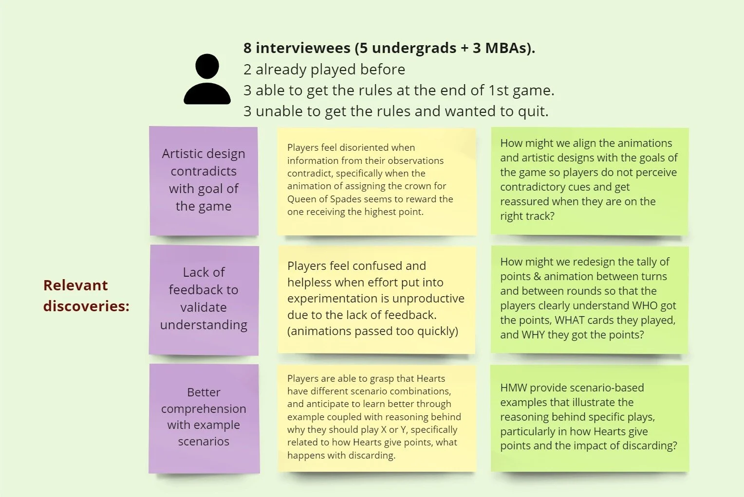
1. Players feel disoriented when information from their observations contradict.
Despite the tutorials and pop-ups reminding them that gaining points is bad, these players are confused when seeing this big crown with +13 assigned to the third player.
Players’ confirmation bias—expecting points to be good—led them to misinterpret game cues. This reinforced confusion and hindered their understanding of the rules.
2. Players feel helpless when effort put into experimentation is unproductive due to the lack of feedback.
Players learn by trial and error throughout the game when they feel confused, but the feedback is not accessible enough for players. Players think the animations of cards played and points assigned each turn pass too quickly, but they rely on that information to learn the rules. They want to know WHO got points and WHY.
Moreover,
players feel purposeless and unmotivated when they are making random moves and not perceiving progression over trials, and this will make them quit the game.
When being asked if they would want to play Hearts again, players responded no:
3. Players are able to grasp that Hearts have different scenario combinations and anticipate learning better through examples coupled with the reasoning behind why they should play X or Y.
Knowing the end goal — getting the least points — is not enough for players to strategize their moves confidently; it needs to be put into the context of game mechanics.
Design to combat the counterintuitive game rules.
1. Players feel disoriented when information from their observations contradict.
How might we align the animations and artistic designs with the goals of the game so players do not perceive contradictory cues and get reassured when they are on the right track?
2. Players feel helpless when effort put into experimentation is unproductive due to the lack of feedback.
How might we redesign the point tally and animations to clearly show who got points, what cards were played, and why?
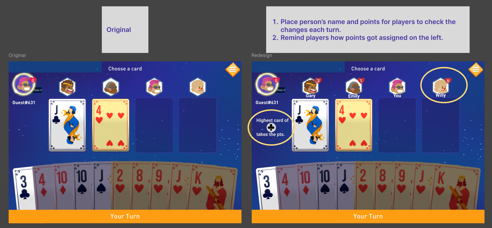
In the original design, the animation of the point assignment passes rapidly and players can barely tell who gets the points and why.
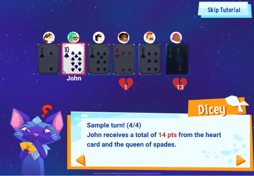
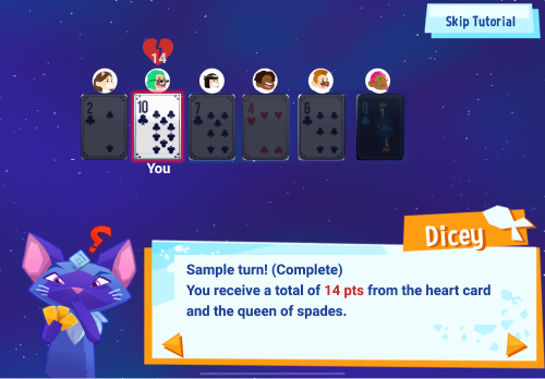
The redesigned interface includes player names and point statuses, providing real-time feedback on how points are assigned each turn.
Also, I made the animation more explicit about where each point assigned is from.
Original
Prototype
3. Players are able to grasp that Hearts have different scenario combinations and anticipate learning better through examples coupled with the reasoning behind why they should play X or Y.
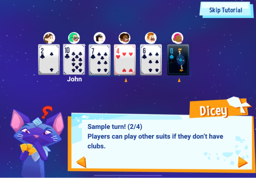
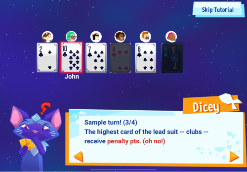
How might we provide scenario-based examples that illustrate the reasoning behind specific moves before they head into the game?
Insert sample turn in the tutorial (view above) for players to contextualize the rules before starting the game.
Conclusion
I was excited to see several of my proposals implemented, including a bold rule reversal that changed the game’s dynamics. This experience boosted my confidence in proposing innovative solutions and reinforced the importance of user-centered design, even in long-standing games.
Hearts presented more complex challenges than SushiGo!, as player confusion stemmed from multiple factors. By analyzing user data and redesigning key elements—textual cues, colors, animations, and even rules—I developed sharper analytical skills and a deeper understanding of how design impacts cognition.

