Redesign of SushiGo! for Improved User Onboarding and Engagement
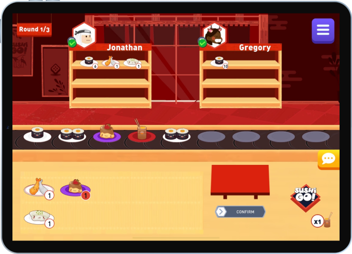
As an intern at Boardible, a startup developing a mobile app hosting a collection of digital tabletop games, I led the UX redesign of SushiGo!, focusing on improving the onboarding experience to clarify the point system and highlight the game’s competitive elements. By refining the user flow, I aimed to enhance player engagement and retention.
Locating roadblocks to smooth onboarding.
Conducted user testing by observing new players and facilitating think-aloud sessions to gather insights on their interactions and challenges with the interface.
Analyzed the data using theme-based clustering and created user journey maps to identify pain points and opportunities for improvement.

*Assigning different colors to different interviewees’ responses allowed me to gauge whether a problem was shared across multiple interviewees.


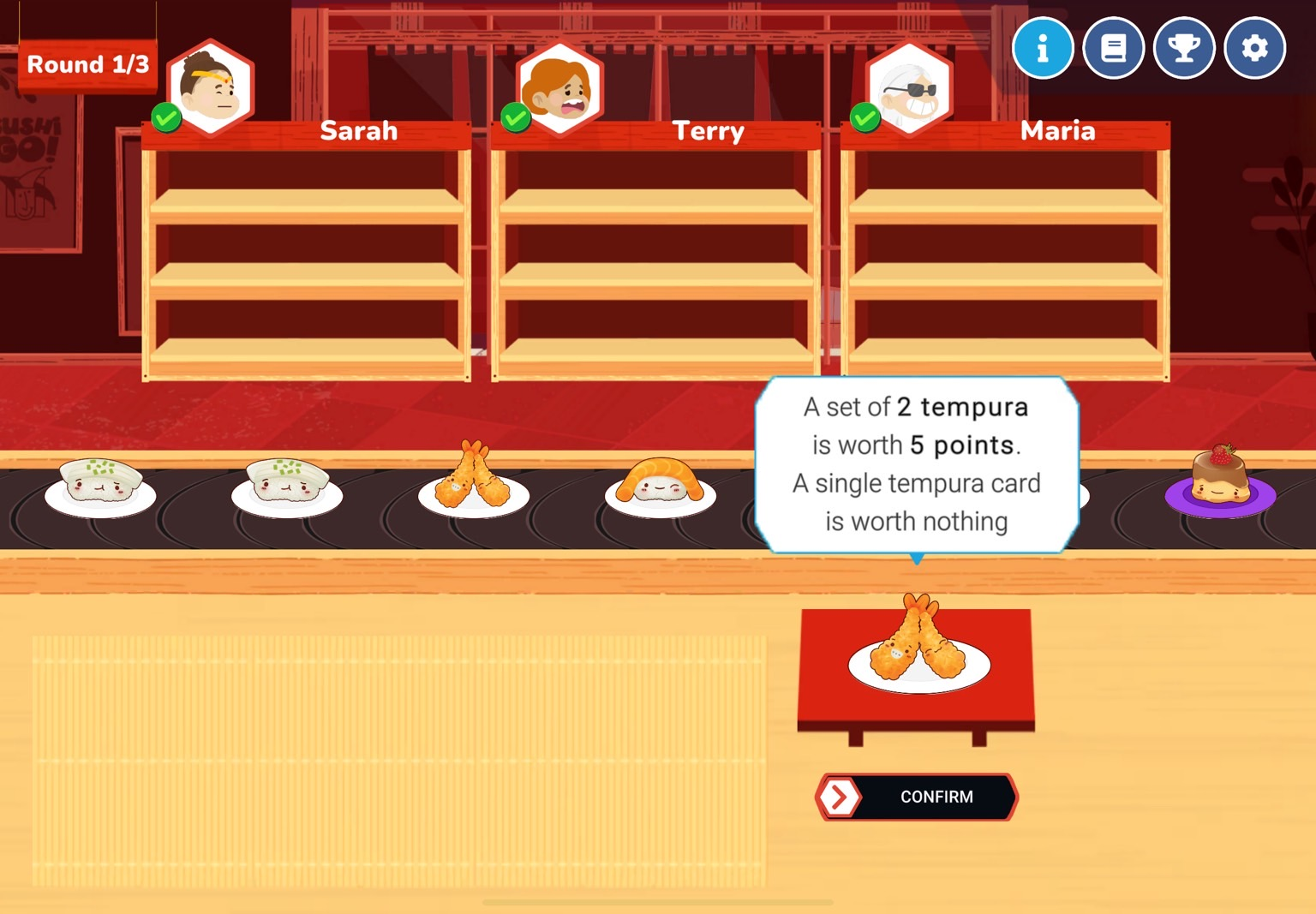
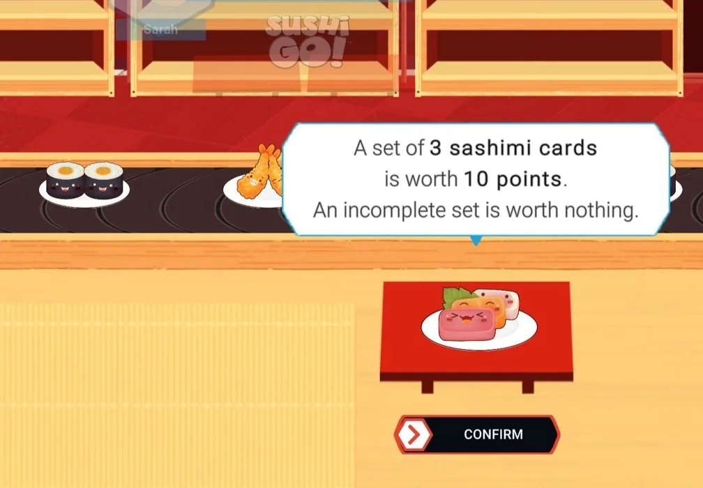
1. Players get confused when one rule can be interpreted in different ways.
“A set of 2 tempura…” Already 2 pieces of tempura on this plate, so do I need to collect more tempura cards?
“A set of 3 sashimi…” Already three pieces of sashimi on this plate…
2. Failure to activate superpowers they intentionally collect due to mistimed pop-ups frustrates players because it makes their previous effort and decision-making useless.
Some players struggled to activate superpowers, which undermined their confidence in navigating the game. This failure disrupted their sense of progress, especially as they were transitioning from theoretical understanding to becoming fully engaged players mastering the game's mechanics.

Practical redesign considering the developer capacity at the new startup.
1. Simplified in-game language to clarify rules around “sets”

2. Tutorial highlights and pop-up administration to remind players to use their superpowers.
a. I highlighted the SUSHIGO! button to make the feature more intuitive.
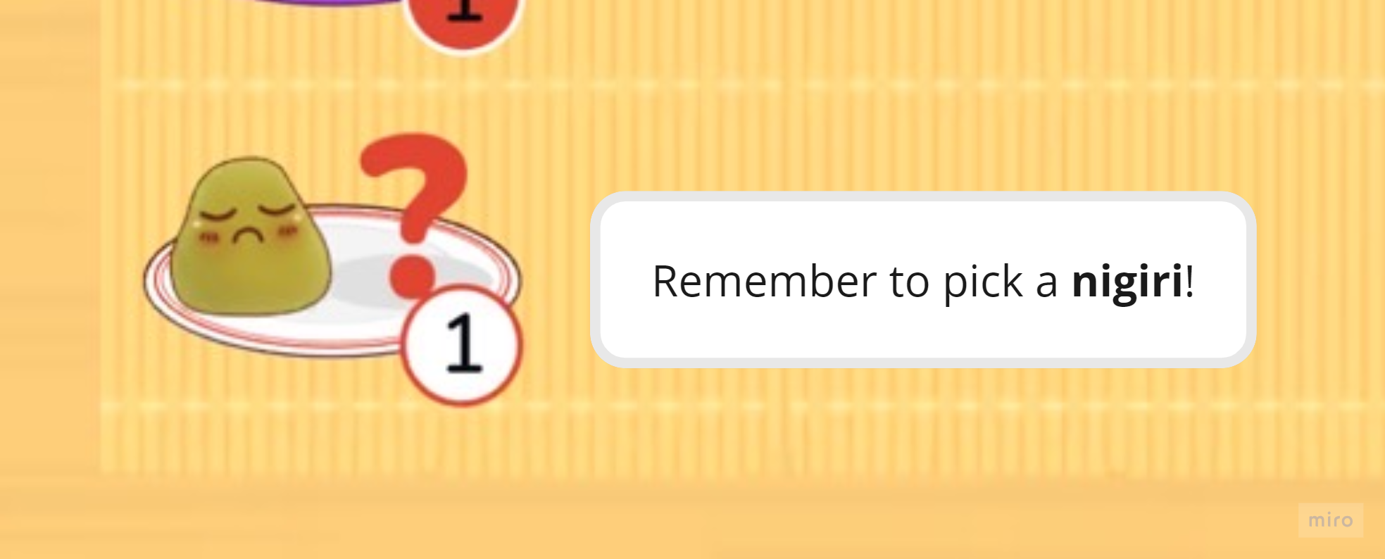
b. I included nigiri icons in the tutorial for users who failed to activate superpower due to unfamiliarity with dish jargon.

c. I increased in-game pop-ups to reinforce learning.

2nd round of playtests with physical mock-ups

Designing for a fun experience.
With the confusion around sushi's special effects resolved, now what?
Analysis process same as the first round of play tests and interviews

Key finding: Players didn’t get the strategic fun of the game because they feel that winning is chancy.
Players struggled to grasp the game’s strategic elements, believing that luck determined success.
To address this, I clarified the competition around a fixed set of sushi and introduced visual cues, like empty plates, to help players track game progression and understand the competitive dynamics.
Design for players to notice the fun.
a. Explicitly communicate to players that they compete for a fixed source of sushi and do not simply receive a random set every turn.
b. Encourage players to think competitively against other players to inspire strategic planning.
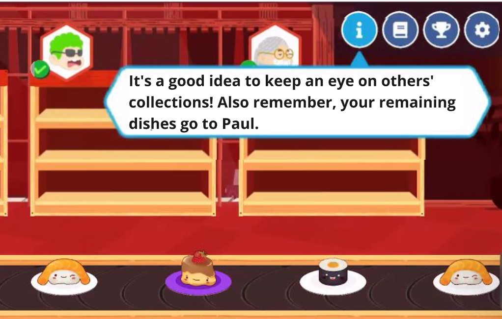

c. Show empty plates to indicate that it is the same belt and dishes are being picked each turn, as well as allow players to feel the progression of the game.
Conclusion
My design proposals were implemented successfully, recognized for their practicality within the startup’s constraints. This experience taught me how to balance short-term user needs with long-term retention goals by aligning game mechanics with player understanding. I learned the importance of identifying how users interact with game elements to uncover opportunities for improvement.